High-Converting Law Firm Website Design Today
Master design principles, CTAs, forms, and user experience to turn more visitors into paying clients with science-based strategies.
Author: App Wizard
Published on December 28, 2025
Share this article
Share with your network or copy the link
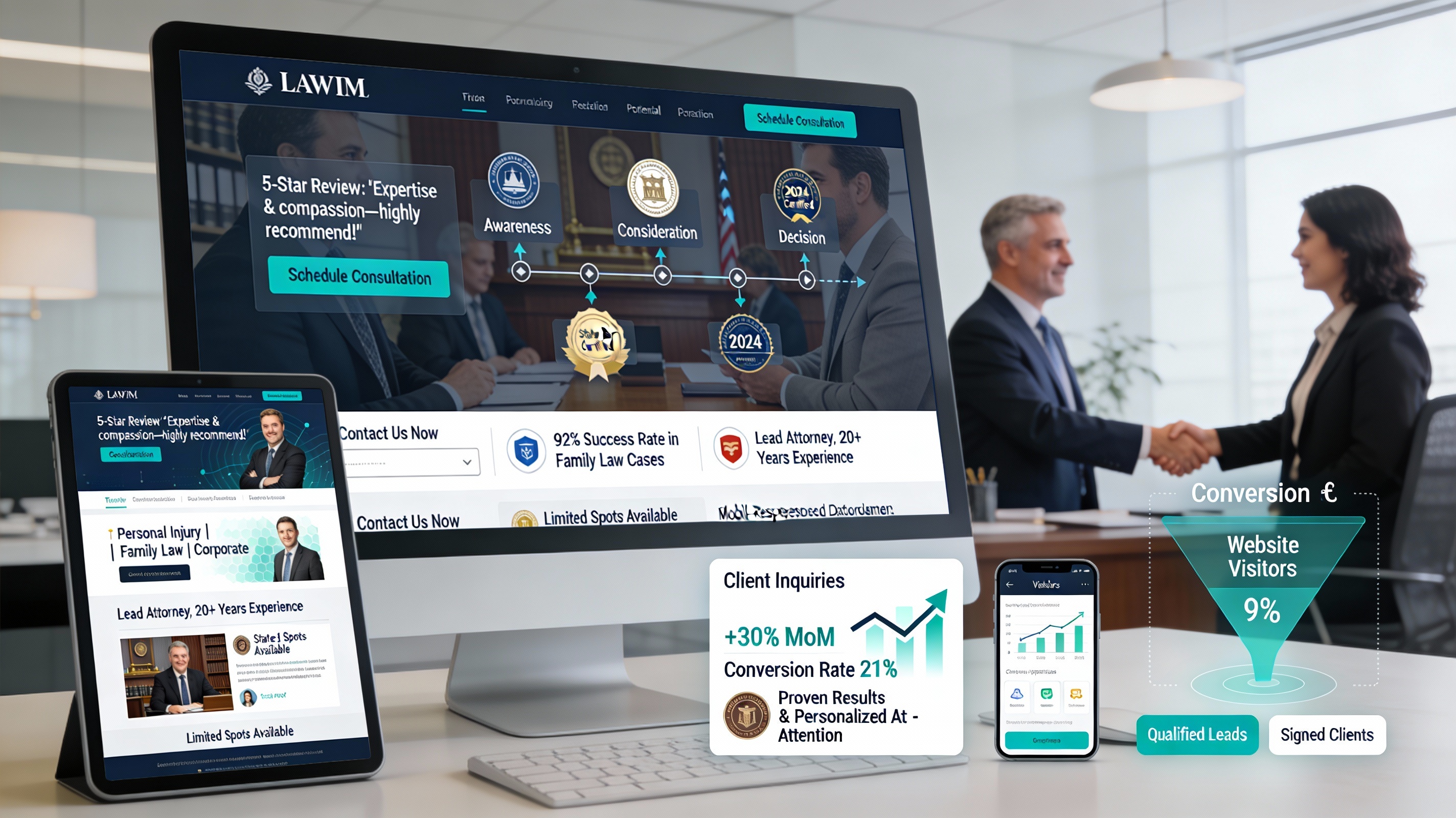
The Economics of Website Conversion
A 1% improvement in conversion rate can mean the difference between a struggling practice and a thriving one. If your law firm website gets 1,000 visitors per month and converts 2%, that's 20 new client inquiries. Improve conversion to just 3%, and you'll get 30 inquiries—a 50% increase with no additional marketing spend.
The Anatomy of a High-Converting Law Firm Website
1. Clear Value Proposition (Above the Fold): Visitors should immediately understand what you do and why they should hire you.
2. Social Proof: People trust other people. Include client testimonials and reviews, case results and success stories, bar association memberships and awards, and number of cases handled and settlements achieved.
3. Trust Signals: Reassure visitors that you're legitimate with professional photos of your office and team, clear contact information and office address, license information and bar membership, and security badges and privacy policy.
4. Clear Navigation: Users should find what they're looking for in 2 clicks or less.
The Power of Compelling Calls-to-Action
Your CTAs should be Specific (like "Free 30-Minute Consultation"), Action-Oriented (use verbs like "Get," "Schedule," "Claim"), Benefit-Focused, Visually Prominent, and placed in Multiple locations including header, footer, and throughout content.
Page Speed and User Experience
Site speed directly impacts conversion rate. Every 1-second delay in page load time can decrease conversions by 7%. Optimize by compressing images, minimizing CSS and JavaScript, enabling browser caching, using a Content Delivery Network (CDN), and targeting pages that load in under 3 seconds.
Mobile Optimization is Non-Negotiable
Over 60% of law firm website visitors are mobile. Your site must be fully responsive and mobile-friendly, have easy-to-tap buttons and forms, reduce form fields to essential information only, make your phone number clickable, and test on multiple devices and browsers.
Forms That Convert
Shorter Forms Convert Better: Ask only for essential information (name, email, phone, practice area).
Form Design: Place forms on both your contact page and within blog content for easier access.
Form Fields: Clearly label fields and use placeholder text for guidance.
Privacy Reassurance: "Your information is protected by our privacy policy" near the submit button builds trust.
Layout Principles for Law Firms
F-Pattern Layout: People scan websites in an F-pattern. Place important information in this path.
White Space: Don't clutter your pages. White space improves readability and reduces cognitive load.
Color Psychology: Use your brand color for CTAs to make them stand out. Blue (#1b73b4) conveys trust and professionalism.
Typography: Use 2-3 fonts maximum. Make sure font size is at least 16px for body text.
A/B Testing for Continuous Improvement
Test one element at a time to identify what converts best: CTA button color, size, and copy; headline wording; form fields (longer vs. shorter forms); hero image vs. video; and testimonial placement and format.
Measuring Conversion Success
Track these metrics: overall conversion rate (inquiries / visitors), conversion rate by traffic source, conversion rate by practice area page, average form completion time, and bounce rate and average time on site.
Conclusion
High-converting law firm websites combine clear messaging, social proof, trust signals, and excellent user experience. By implementing these principles and continuously testing, you'll increase the percentage of visitors who become clients.